

Wave Magazine Curiosity Issue
The Problem:
Jacksonville University’s brand guidelines were built for consistency, not for the range of stories inside a single issue of Wave Magazine. The Curiosity issue meant covering everything from marine biology to law to behavioral science—subjects with wildly different visual languages and audiences. The challenge was to work within that existing brand framework while making room for scientific diversity that didn't feel flattened into sameness.
At the same time, science content can easily read as clinical or distant. Every topic in this issue was ultimately about a person: a researcher, a discovery, a moment of curiosity that changed something. The design needed to hold both truths—staying recognizably JU while giving each story enough visual space to carry its own emotional weight for the reader.
The Solution:
The cover became the concept: a die-cut brain, inviting readers to physically enter the mind before they ever opened the issue—a metaphor for curiosity itself and an invitation to explore how great thinkers think. That sense of exploration carried through to the table of contents, redesigned around the periodic table as a nod to the scientific rigor behind every story inside.
Each spread leaned on large-scale photography to pull readers into the world of the researcher. Custom typography and illustrations gave each discipline its own visual identity within JU's brand, while graphic elements broke down dense data and findings into bite-sized, easy-to-read visuals—turning complex science into something approachable without losing its substance.
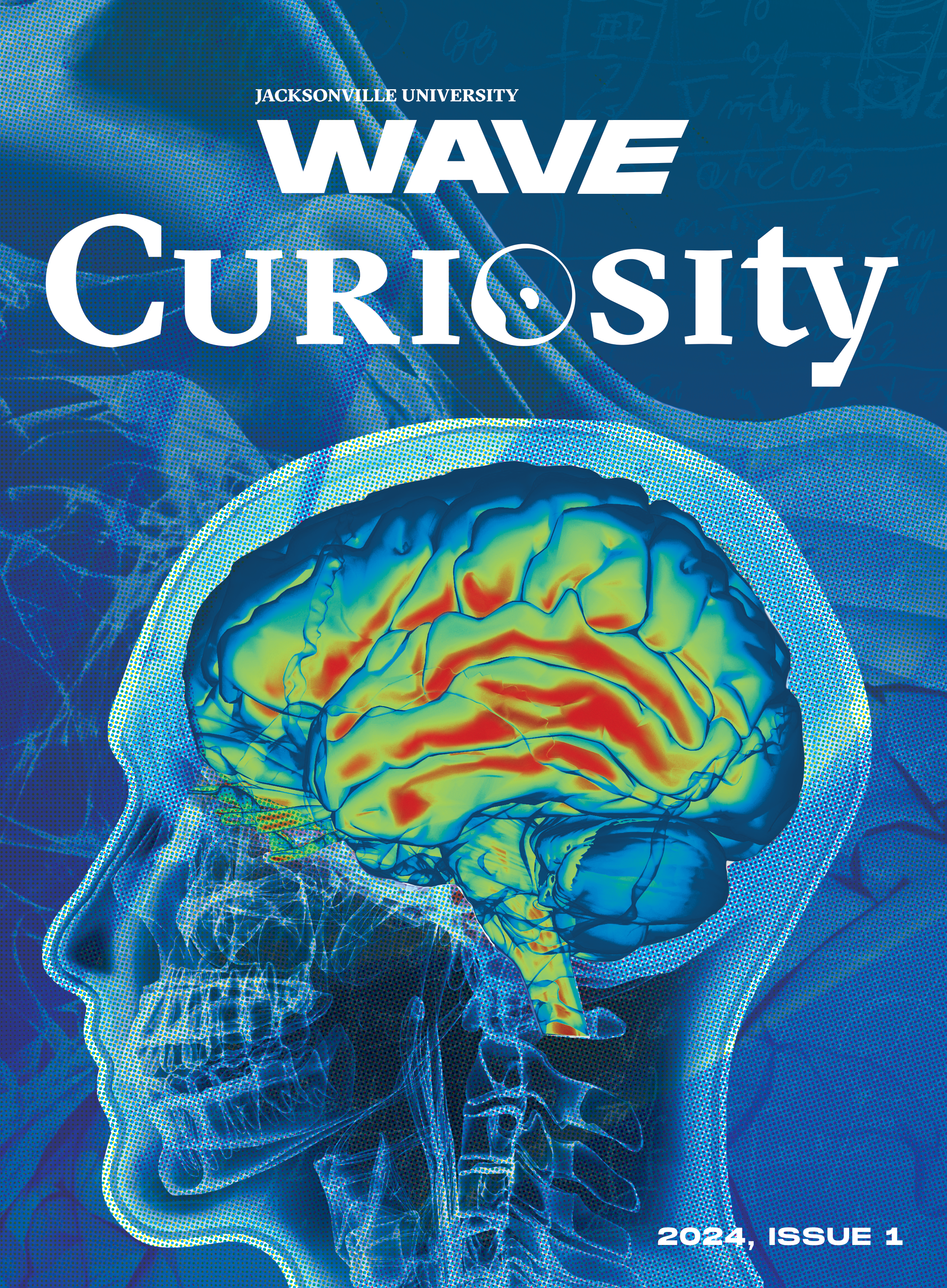
Curiosity Cover Design
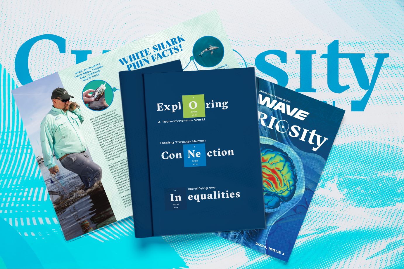
Mockup of Curiosity Pages
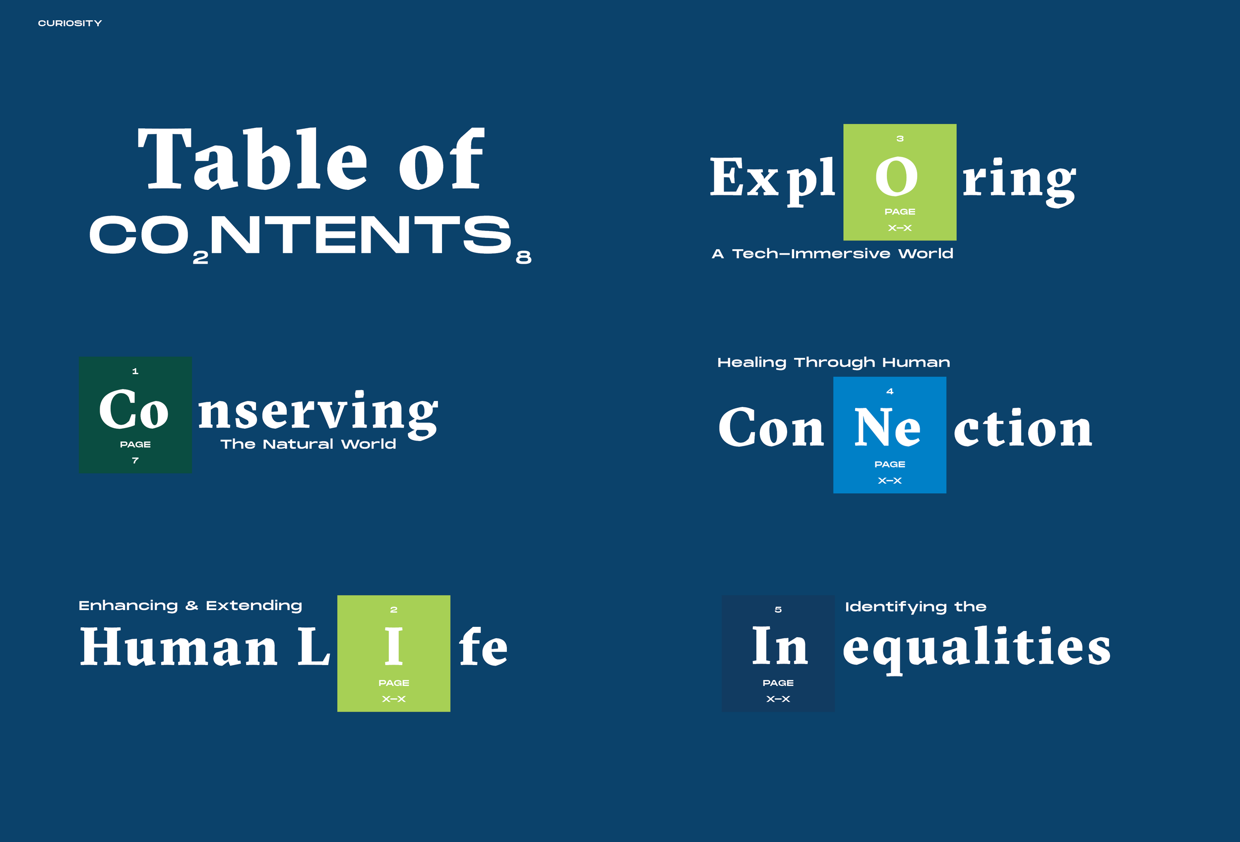
Curiosity Table of Contents Spread
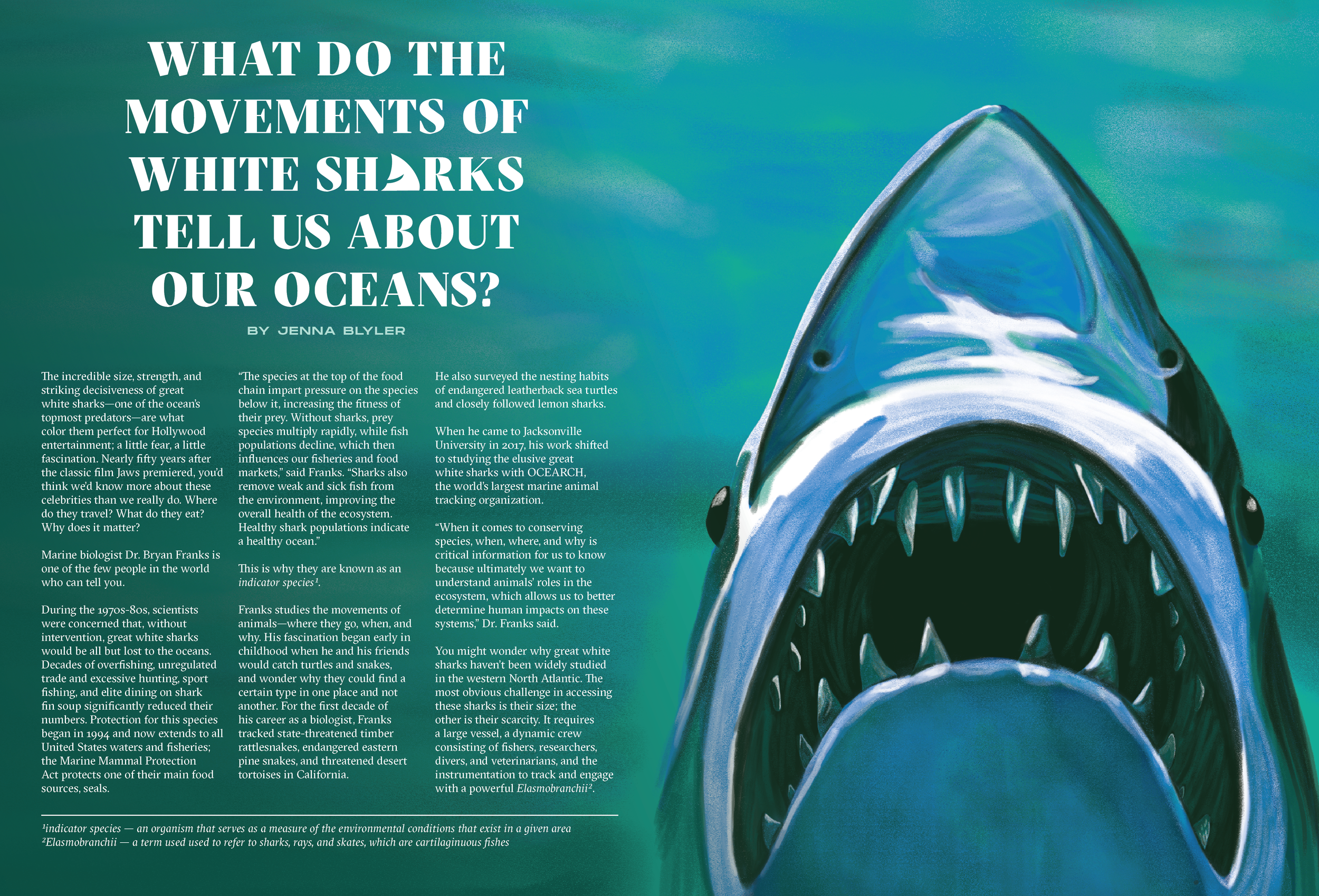
Editorial Intro Spread on White Sharks
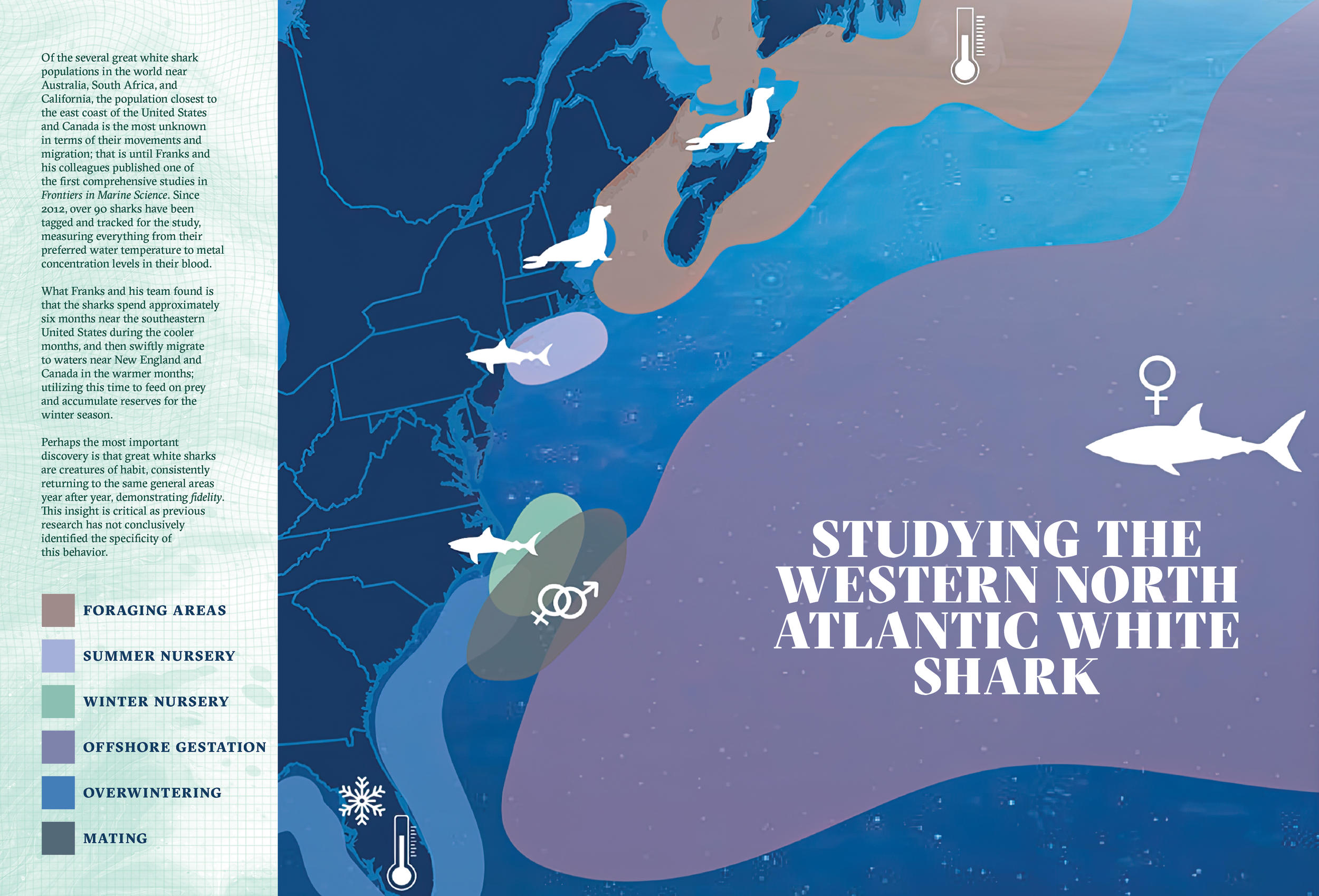
Editorial Spread on White Sharks
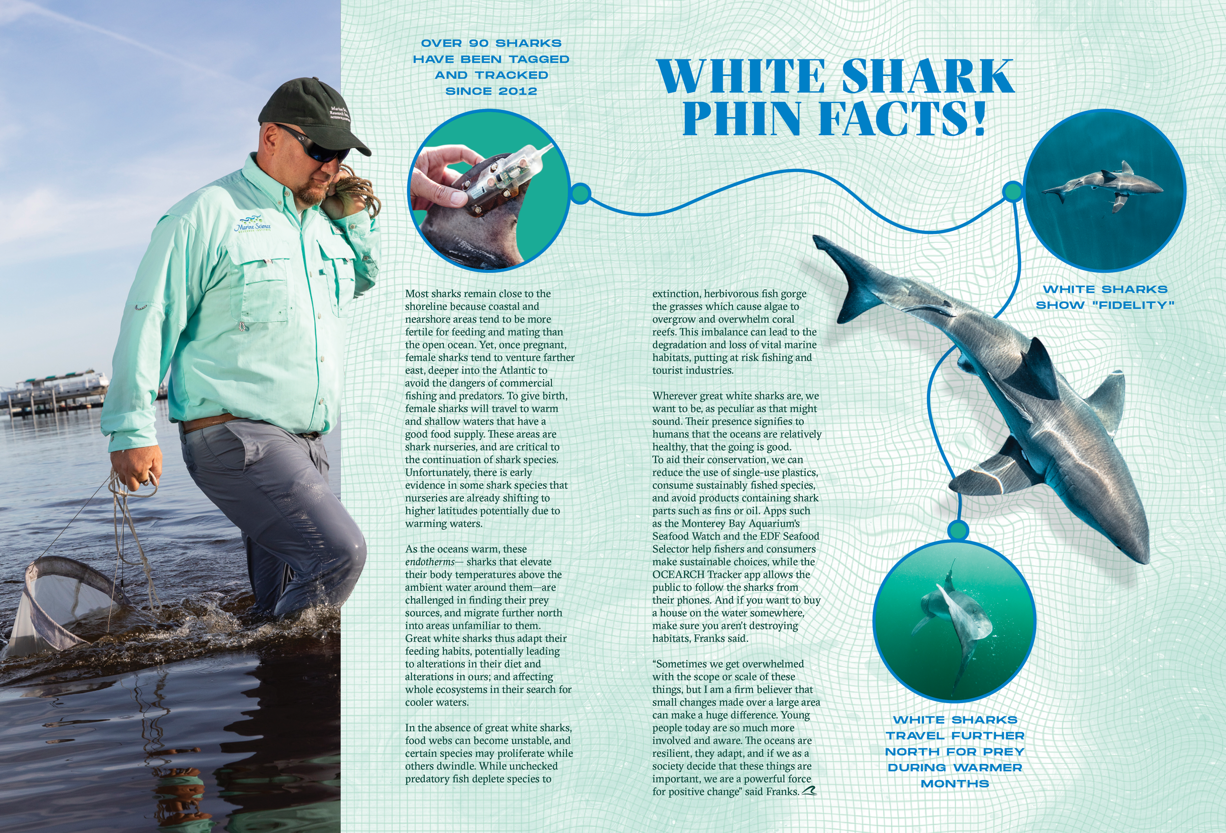
Editorial Spread on White Sharks
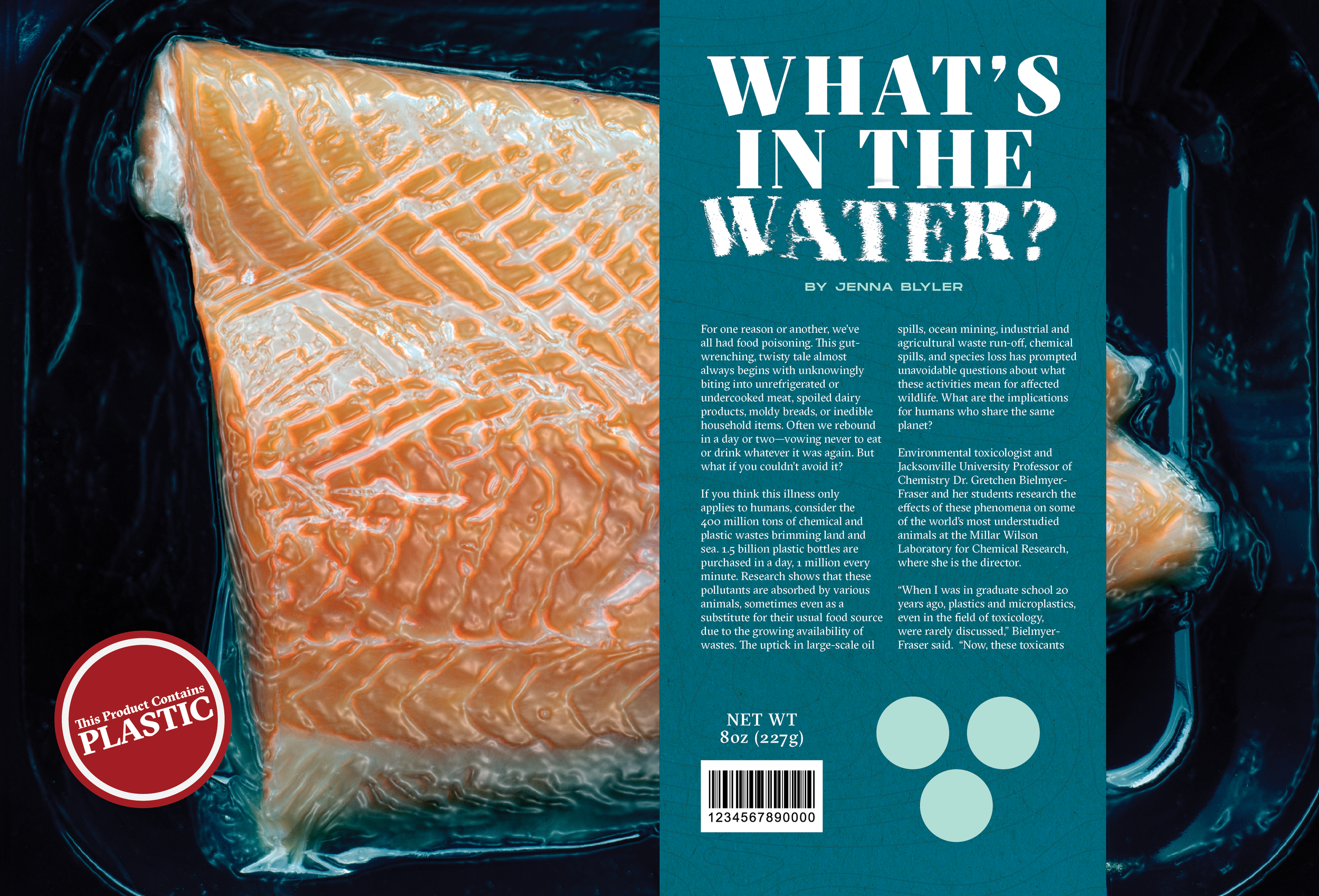
Editorial Intro Spread on Microplastics in Food Sources
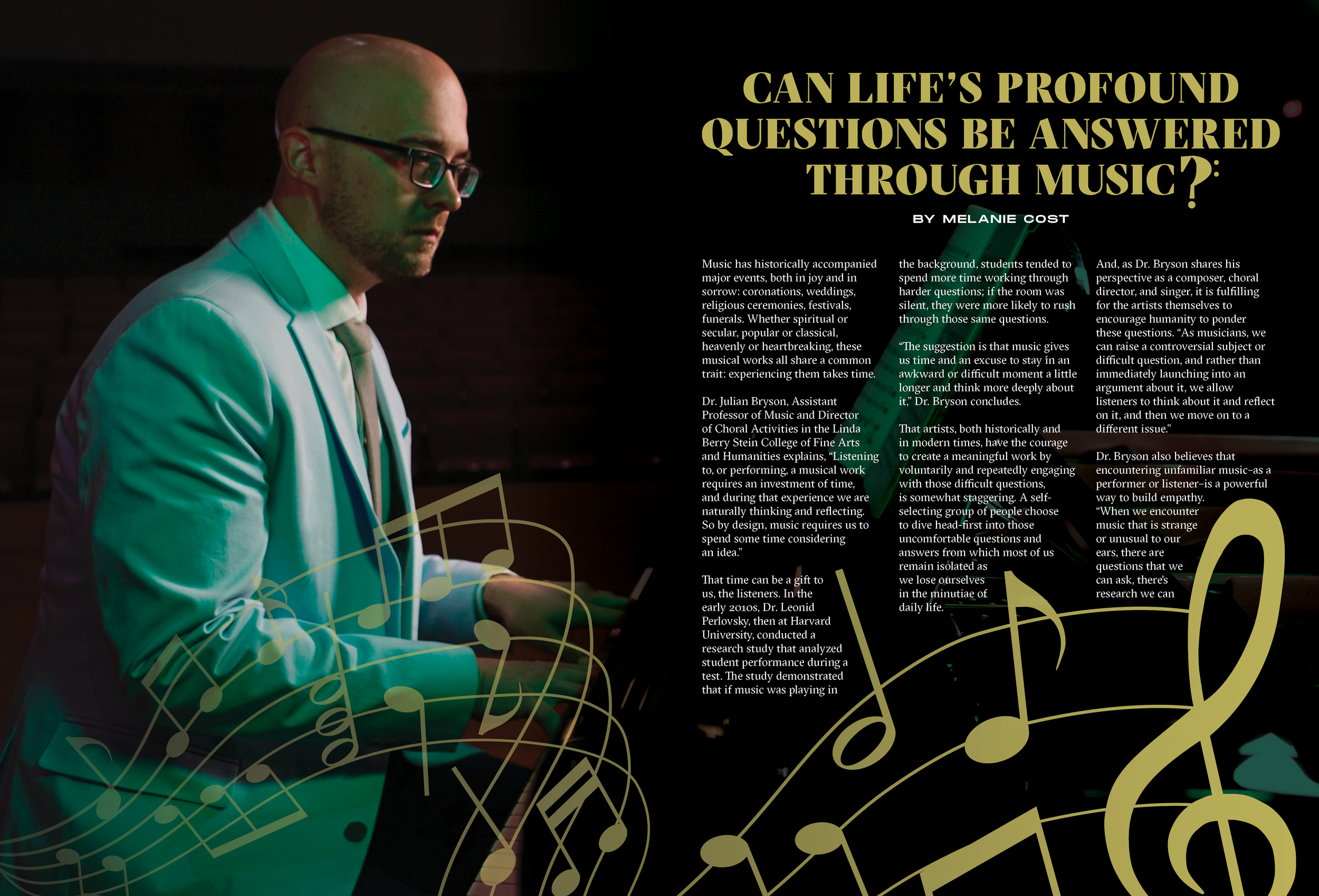
Editorial Intro Spread on Music Therapy
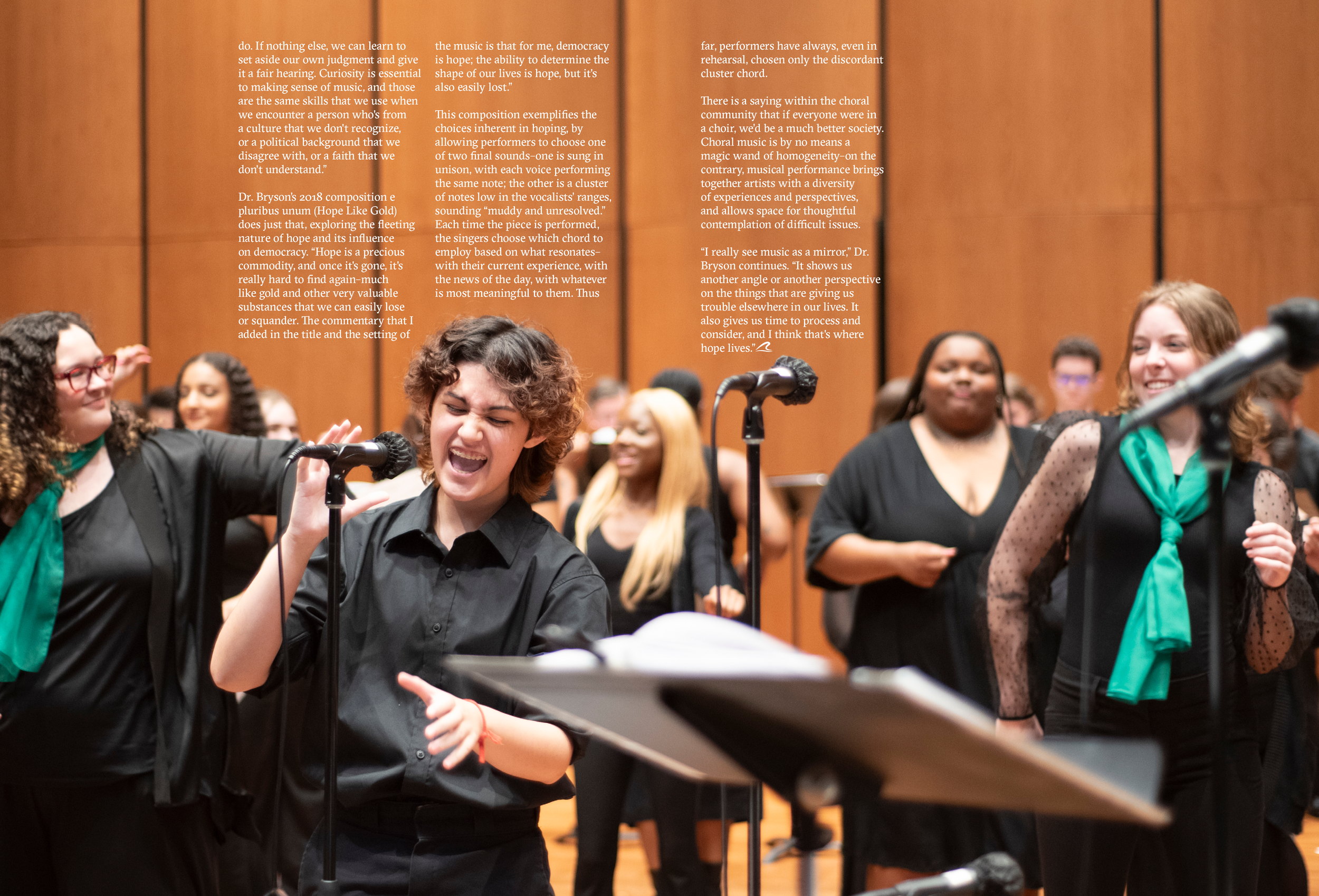
Editorial Spread on Music Therapy
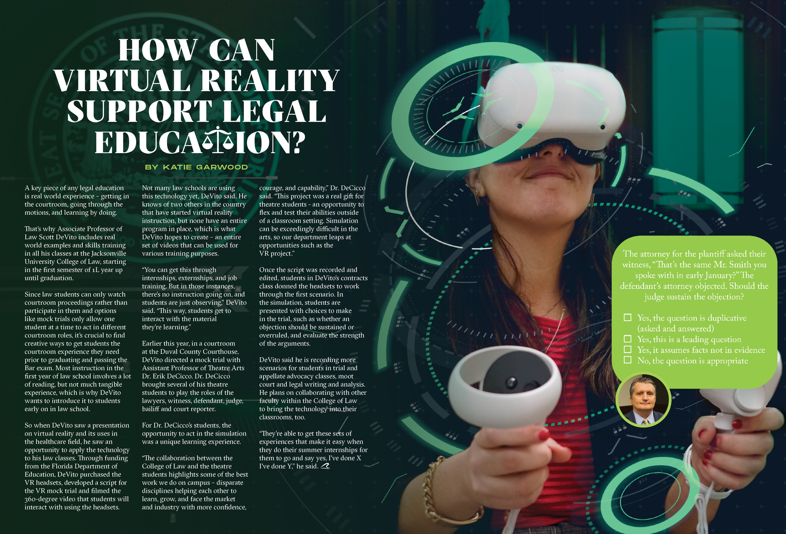
Editorial Intro Spread on Virtual Reality in Legal Education
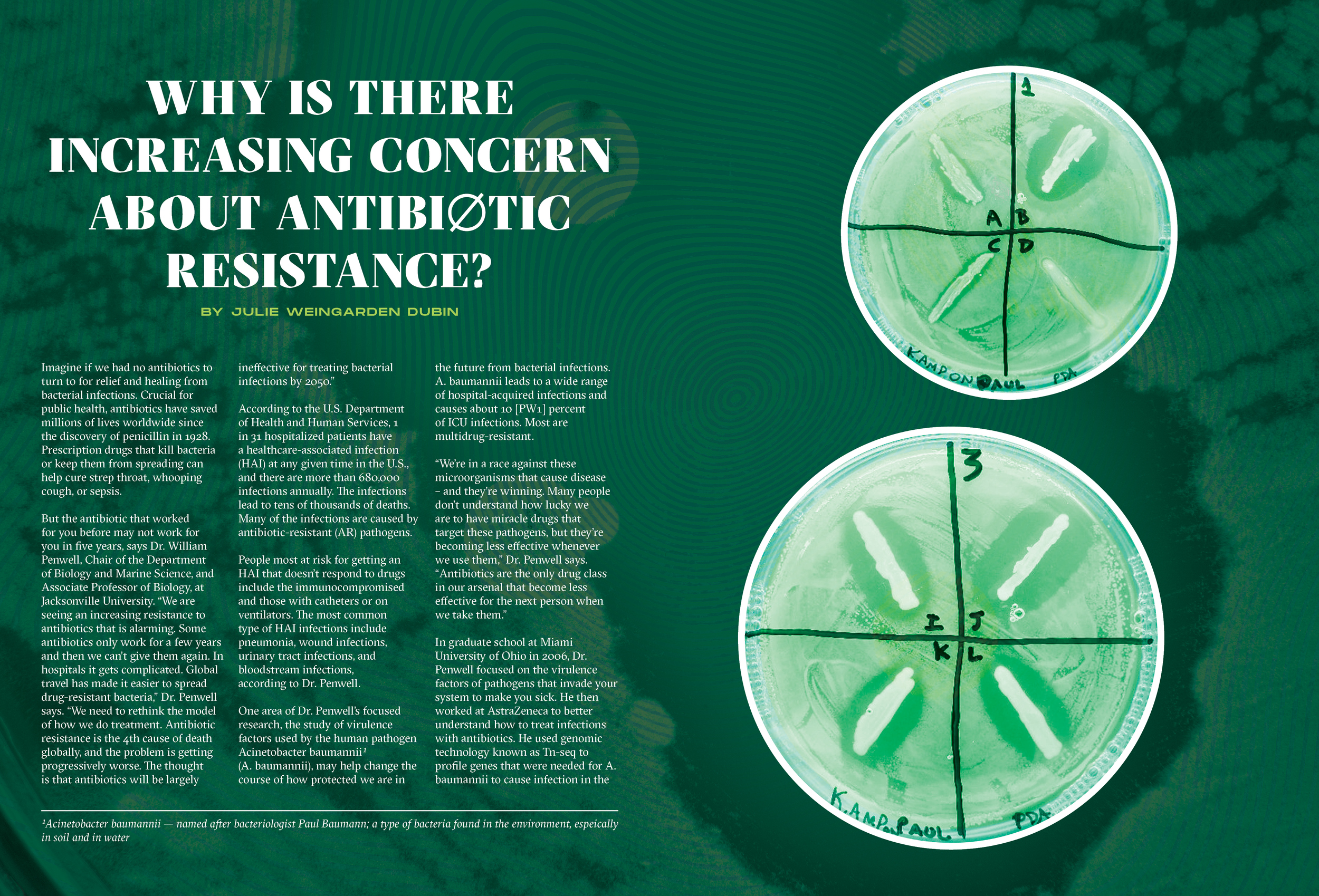
Editorial Intro Spread on Antibiotic Resistance Studies
At Type Y, we connect every dot for your brand so you can lead with impact.
See what else Type Y can build.
Jacksonville University is one story. Every client gets one of their own—built the same way: paying attention, showing up, and making the numbers move.