
Partners for Our Communities
The Problem:
Partners for Our Communities' original website was built years before, and its design hadn't kept pace with the organization's growth. A palette of just two colors left little room to visually represent the full breadth of POC's work—from adult education and youth engagement to case management and immigration relief. The site felt outdated and flat, undercutting an organization whose actual impact is anything but.
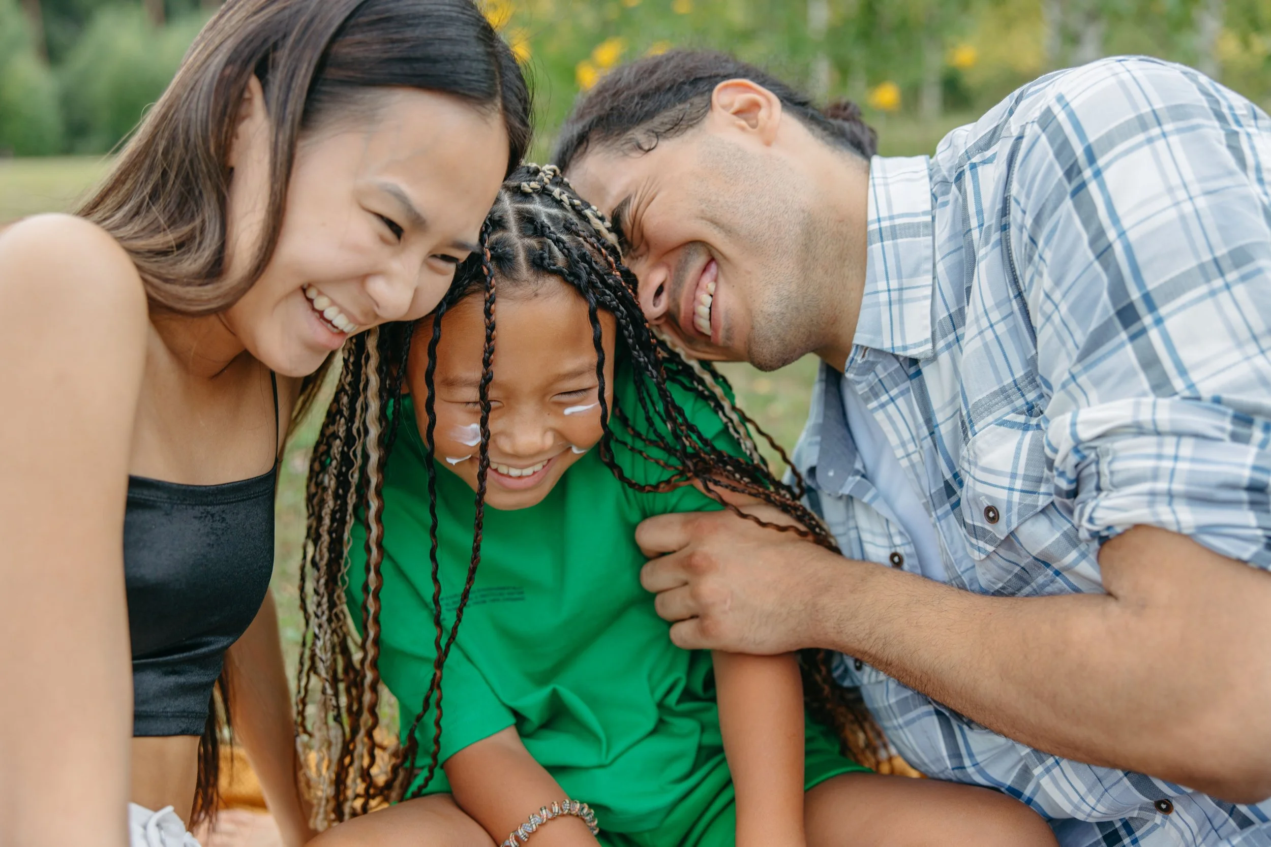
There was also a sensitive constraint to design around: many of the families POC serves can't be photographed for public marketing, whether for legal, safety, or privacy reasons. That meant the redesign couldn't lean on the kind of authentic family photography nonprofits often use to build emotional connection — the solution had to come from elsewhere.
The Solution:
Working in collaboration with Elizabeth Kole Designs, I helped expand POC's brand into a fuller, warmer palette that could carry the range of programs and stories across the site—one that felt lived-in rather than corporate. Where real family photography wasn't an option, we sourced stock imagery carefully, prioritizing authenticity and warmth over anything that felt staged or generic, so the site still felt human and grounded in community.
Under Elizabeth's art direction, I translated that direction into layouts across the site—pages that gave each program area (education, workforce development, case management) its own clear identity while staying part of one cohesive brand. The result is a site that finally looks and feels like the organization it represents: warm, active, and rooted in the community it serves.
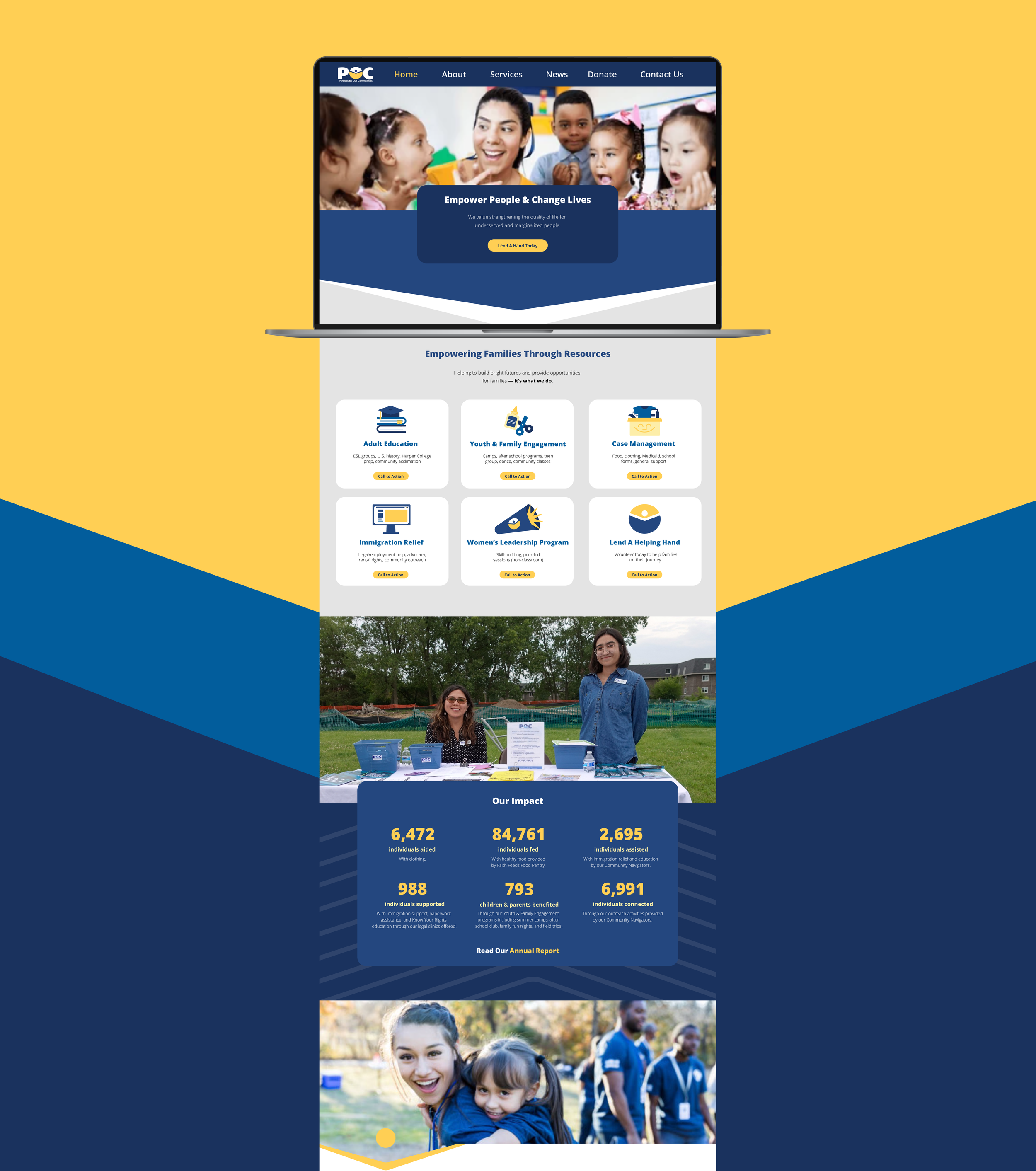
Mockup of Partners for Our Communities Home Page Redesign
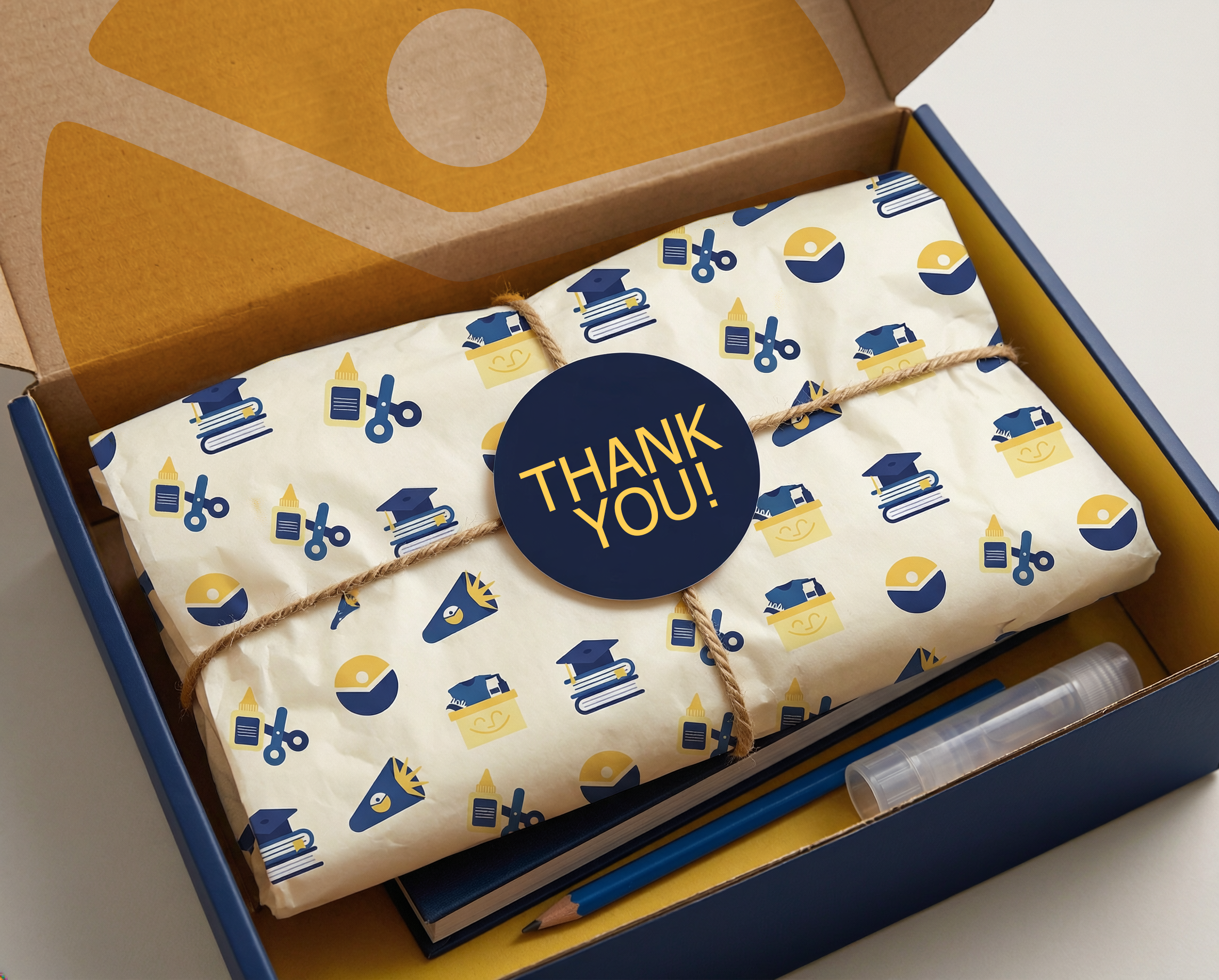
Partners for Our Communities School Program Welcome Box Mockup
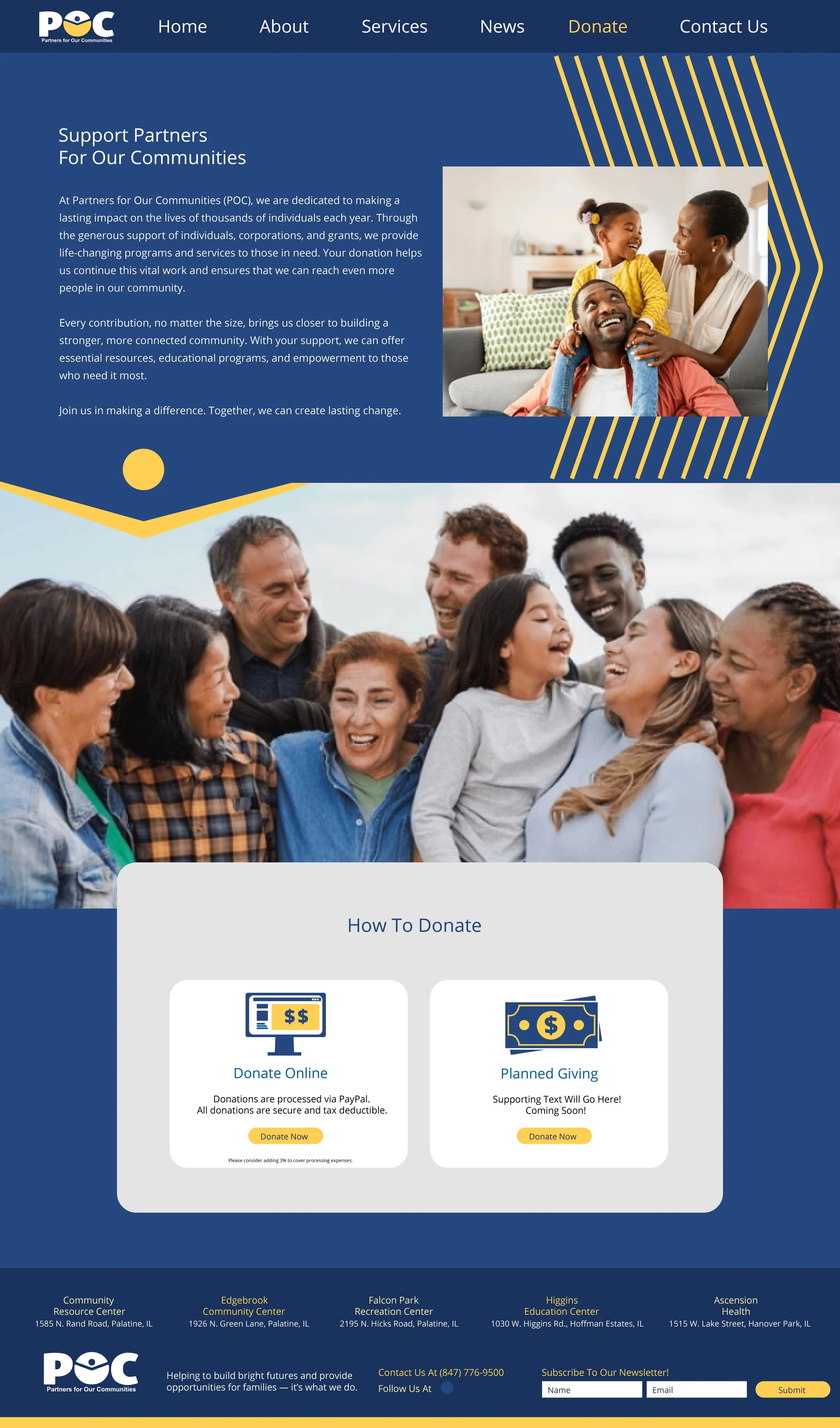
Partners for Our Communities Donation Page Redesign
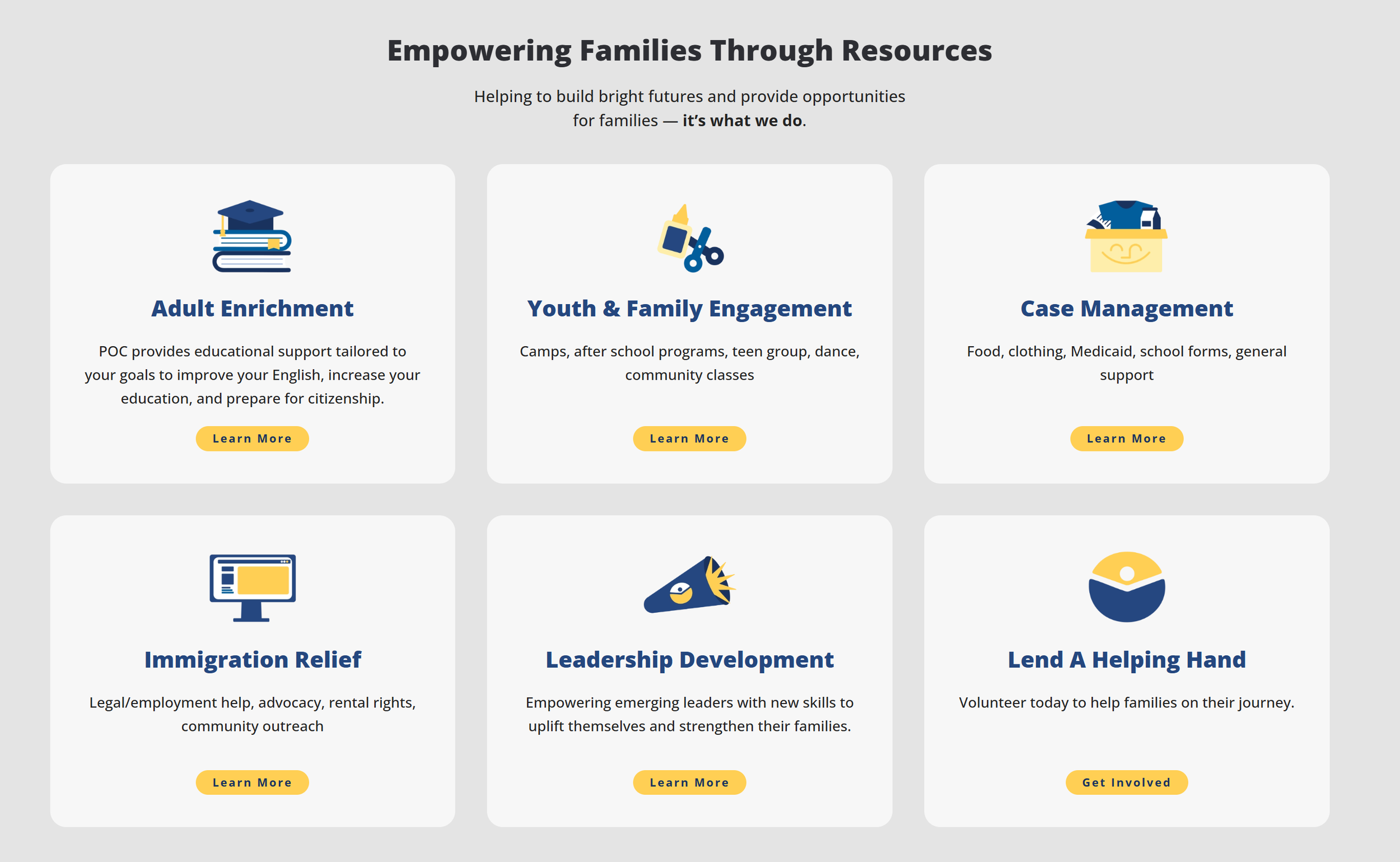
Partners for Our Communities Brand Icons
At Type Y, we connect every dot for your brand so you can lead with impact.
See what else Type Y can build.
Partners for Our Communities is one story. Every client gets one of their own—built the same way: paying attention, showing up, and making the numbers move.